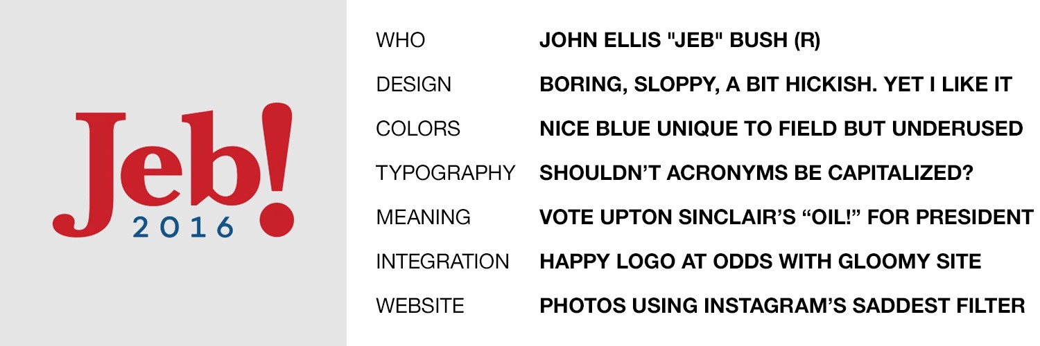
Update June 17, 2015: Messrs. Jeb(!) and T R U M P have been added to this dumb, dumb, roundup of logos. See revised ranking below and additional commentary at the bottom.
I’ve long held the ridiculously biased and shamelessly partisan opinion that Republican campaigns are … uh … less than excellent at graphic design. I have some theories on why this might be the case, which I will not be sharing. What I will be sharing is my attempt at assessing and ranking the logos of the fourteen (as of June 7, 2015) declared candidates. I have also reviewed all of the candidates’ websites for logo integration and overall design, and oh man do you ever owe me for that.
Recommended Stories


As there are currently ten Republican candidates and only four Democrats, this isn’t exactly a fair fight in terms of “which side is better.” The real takeaway is that bad design is bipartisan. Here’s my (attempt at an) unbiased evaluation of the designs:
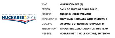
16. Mike Huckabee
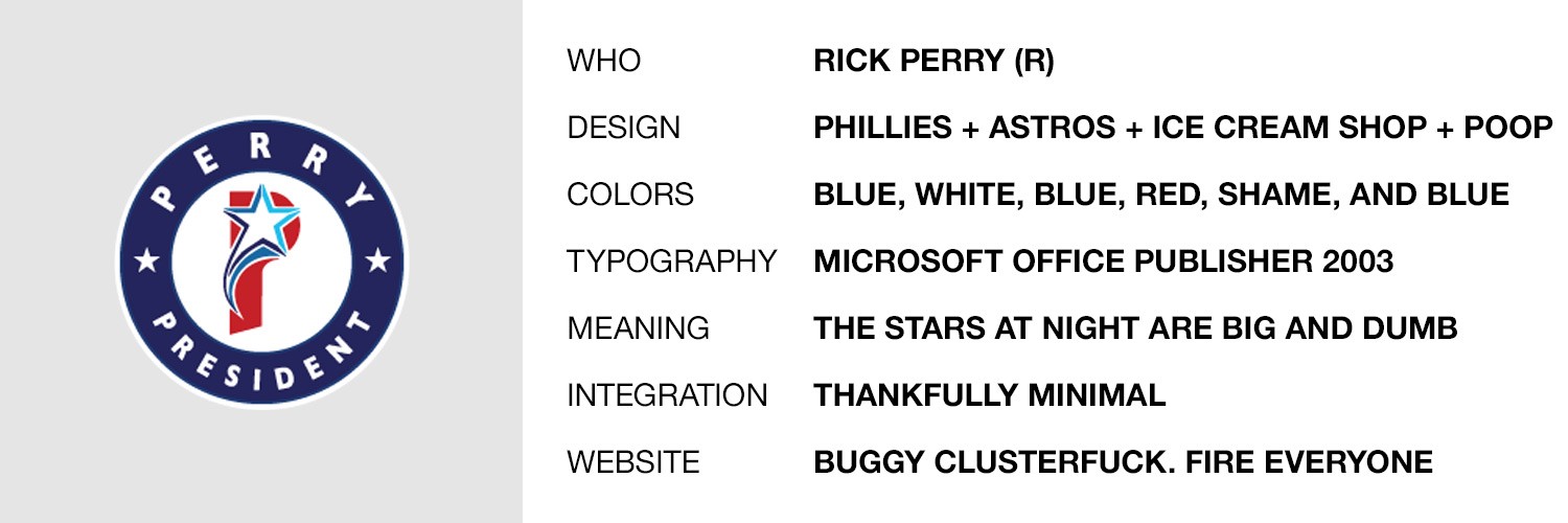
15. Rick Perry
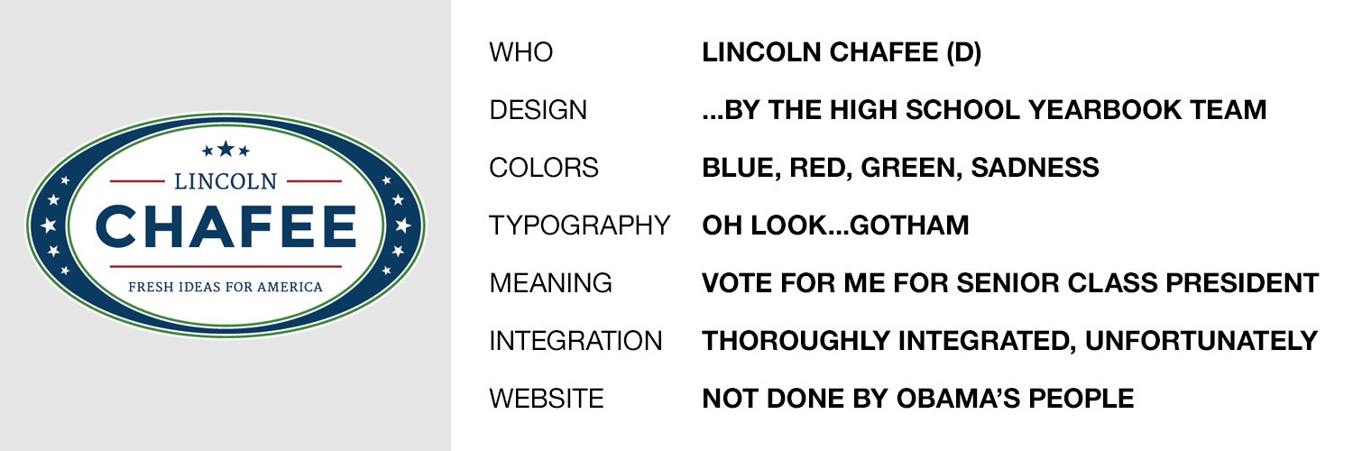
14. Lincoln Chafee
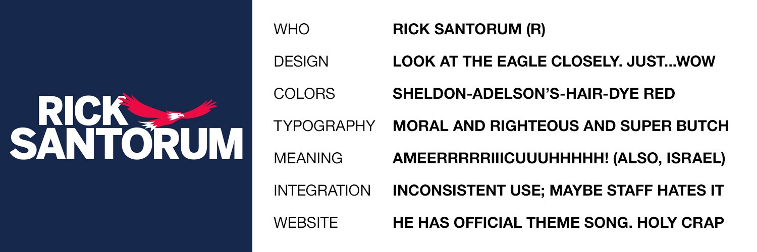
13. Rick Santorum
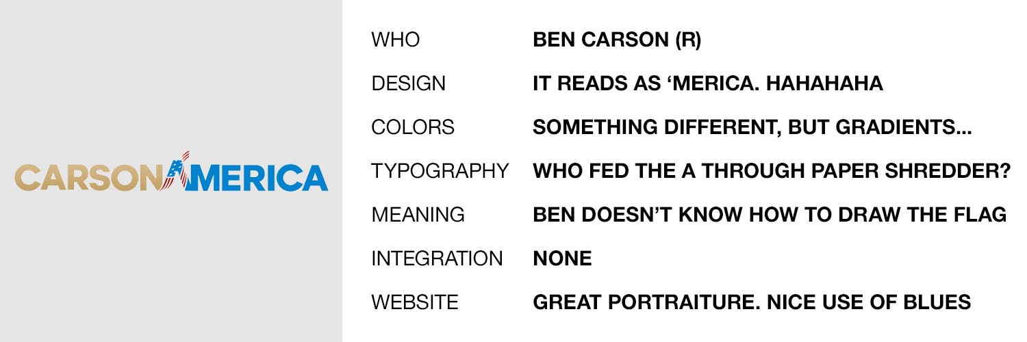
12. Ben Carson
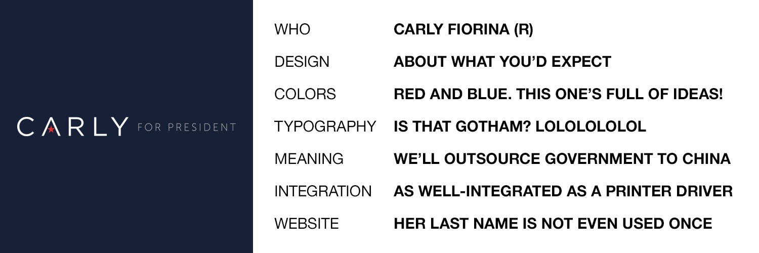
11. Carly Fiorina
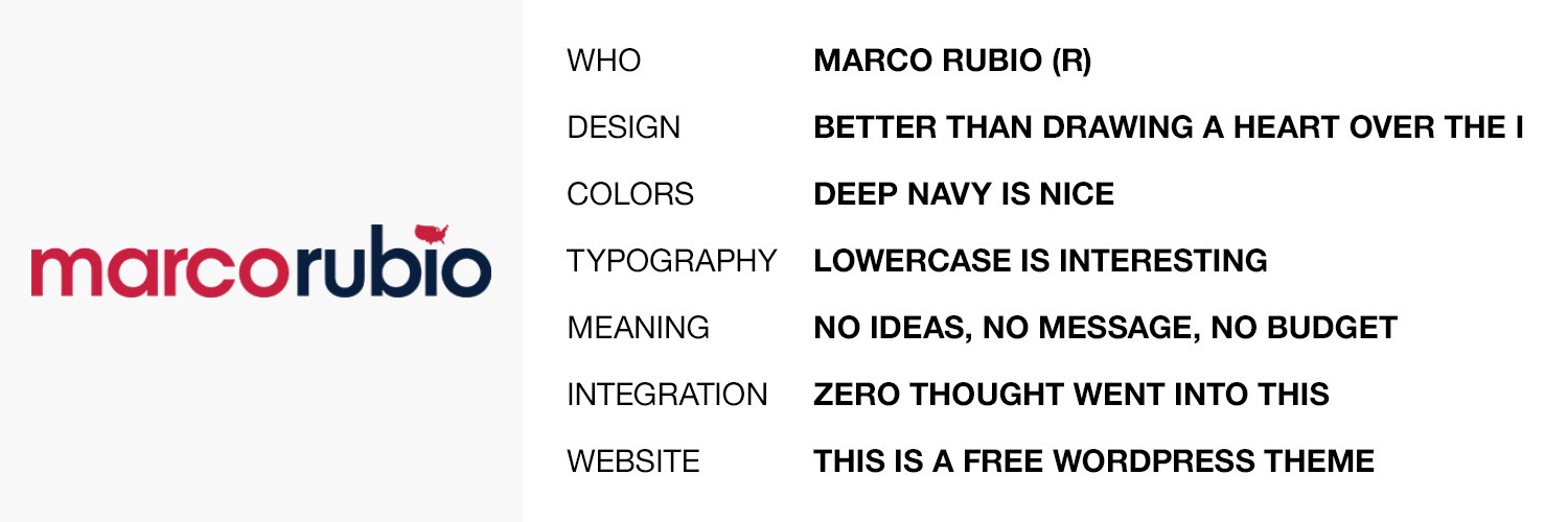
10. Marco Rubio
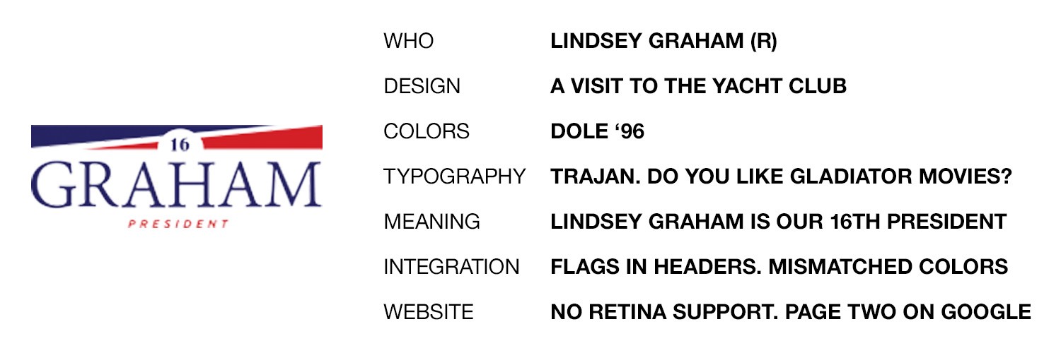
9. Lindsey Graham
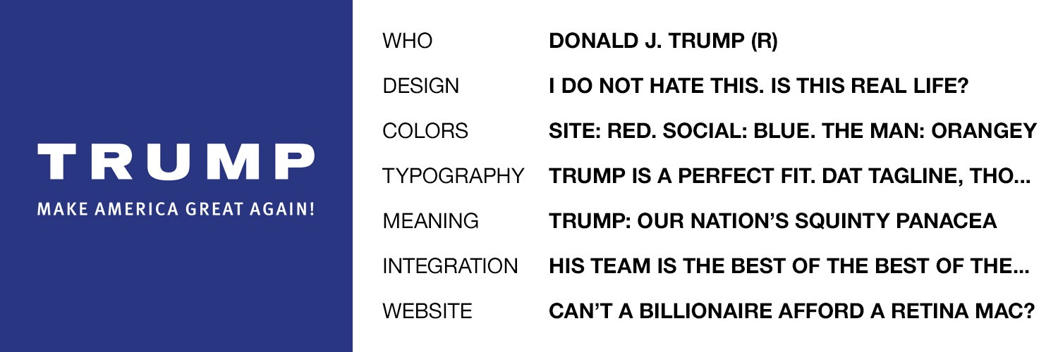
8. Donald Trump
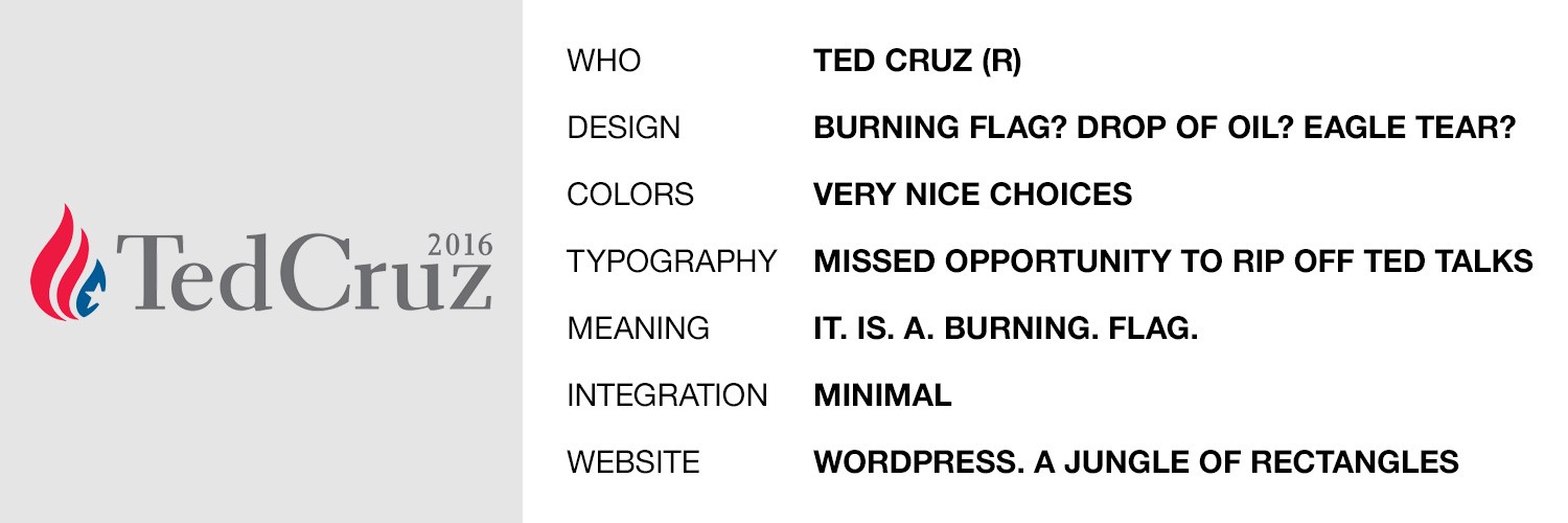
7. Ted Cruz
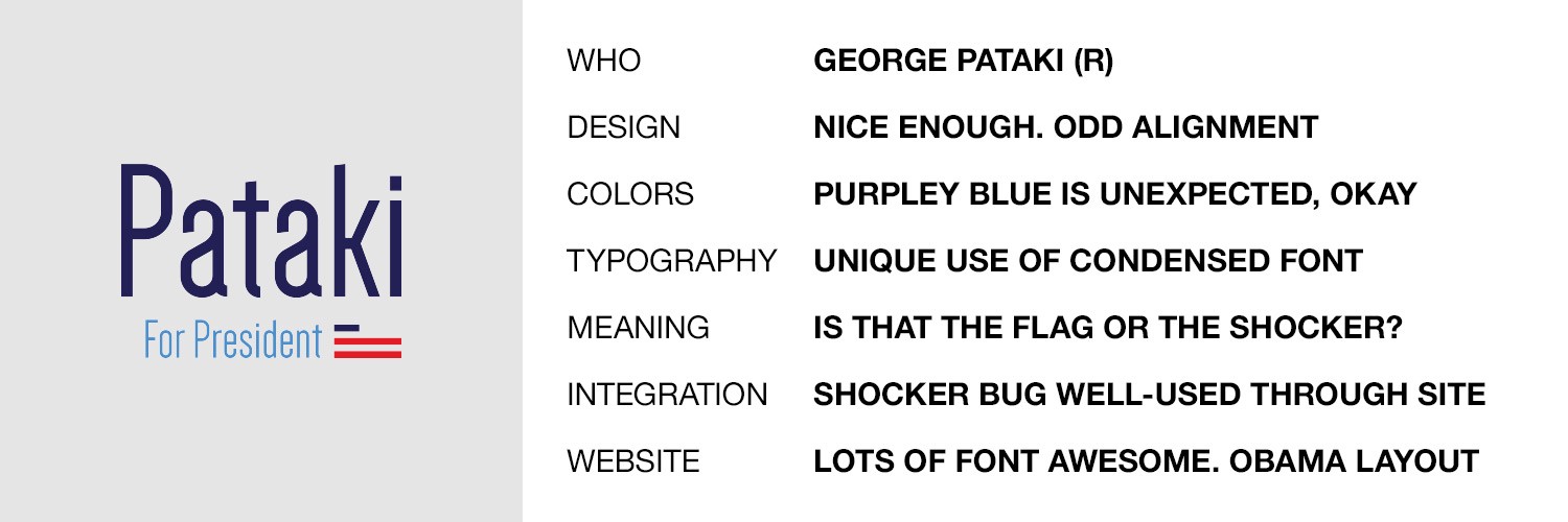
6. George Pataki
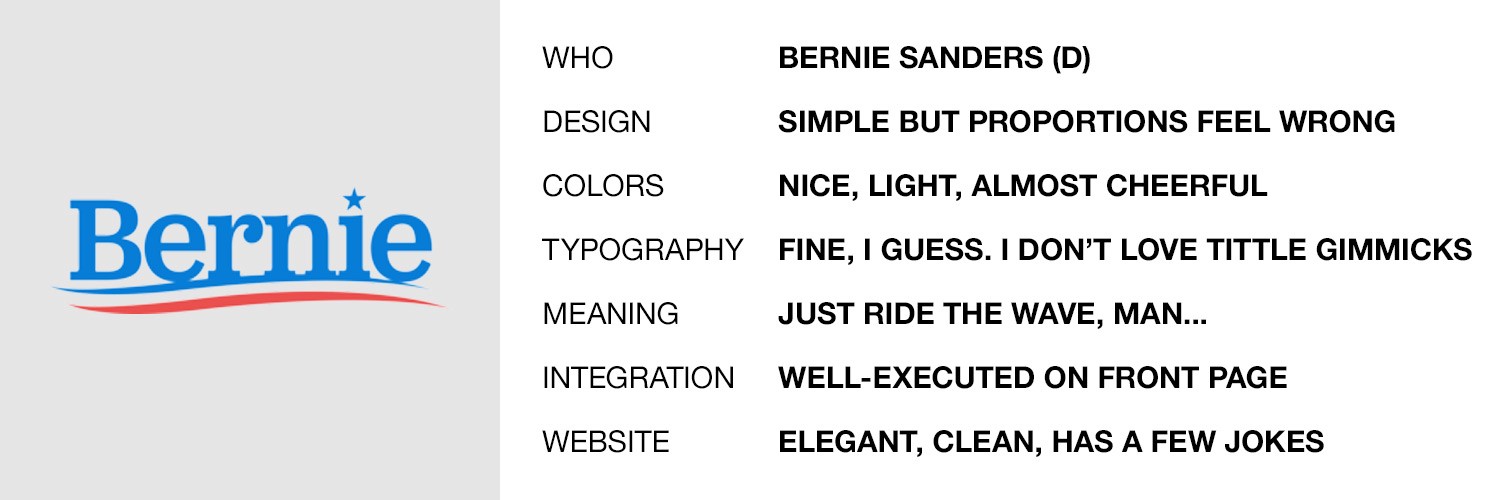
5. Bernie Sanders
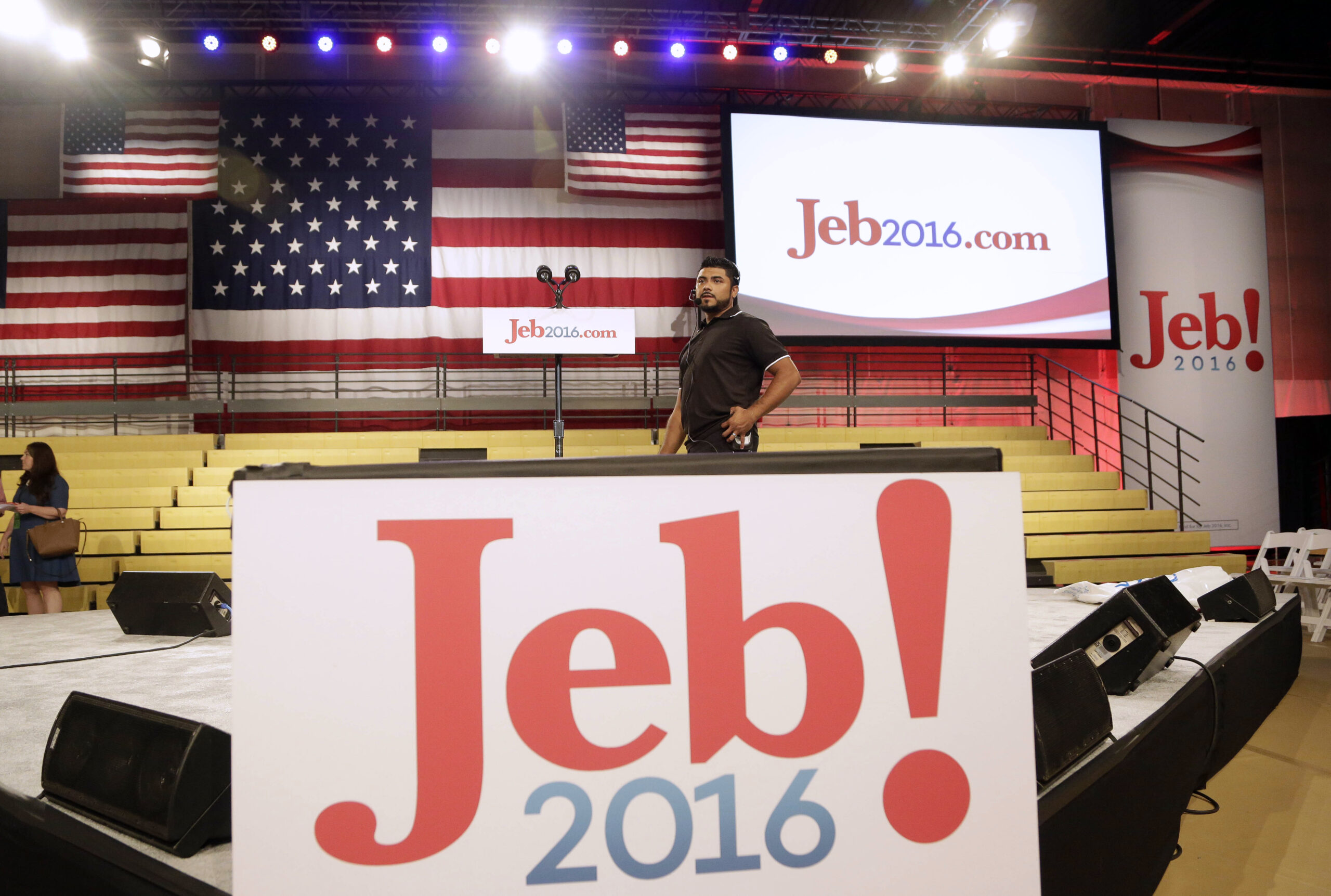
4. Jeb Bush
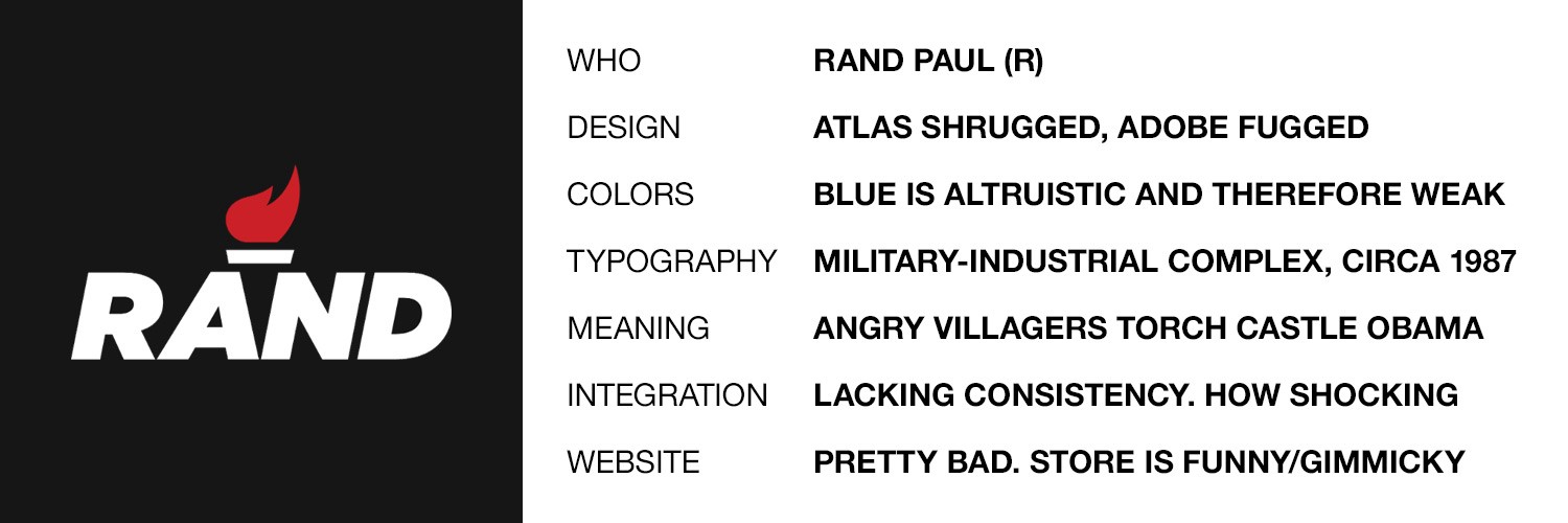
3. Rand Paul
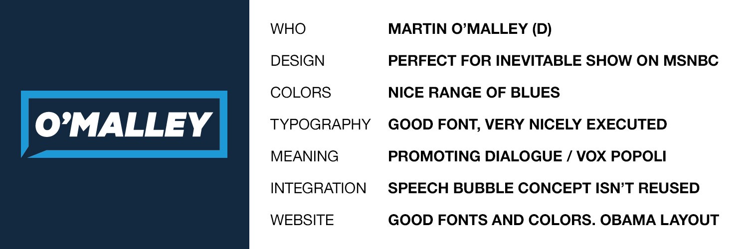
2. Martin O’Malley
1. Hillary Clinton
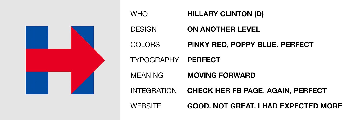
It’s hard to overstate just how much better Clinton’s logo is from the other candidates’. The logo is very simple — yes, your kid could do it; you are SUCH the joke smith! — but the extension into regional Facebook pages, accompanying typography, and even the boldness of not including Clinton’s name speak to branding and campaign direction that is miles and miles and miles ahead of the competition.
Addendum, 6/9/15
I’ve heard from a number of people who hate — haaaaate — Clinton’s logo and think I’m being sarcastic when I say that her branding is “miles […] ahead of the competition.” Take a look at the following Facebook page screen caps for Clinton, my #2 and #3 O’Malley and Rand, and Fiorina, who sports a logo that I’ve been surprised to find many people actually rank highly.
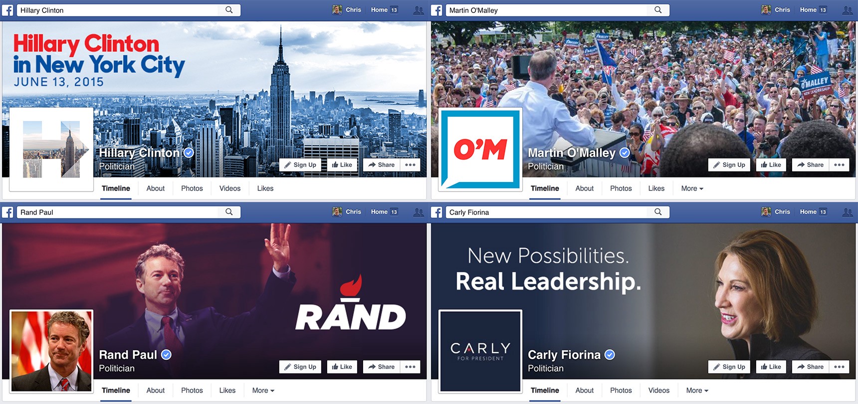
Let’s work from the bottom up. Fiorina’s logo (in addition to being illegible at small sizes) doesn’t have anywhere to go thematically. It’s just that same Gotham Light text, scaled down. The end. I’ve seen a couple of situations where they use the A-with-a-Chinese-star as a logo bug (as a favicon, for instance), but that doesn’t convey anything related to her name.
Rand’s logo is really good. (I’m saying that mostly so a bunch of Rand fans don’t continue to tell me how good it is. I get it…he’s your bro.) But why isn’t the campaign Facebook page using the torch as a profile photo? Why doesn’t it get separated out more on the site? That negative space trick is cute (if a little overplayed these days…like, c’mon) but when you reverse it out and use it on its own, it’s revealed to be simplistic and boring. And again, it does nothing to connect with the candidate’s name.
My biggest objection to O’Malley’s ready-for-MSNBC logo was the lack of carryover onto his website. But look at how well they’ve adapted the concept of the logo to the 1:1 ratio of Facebook’s profile photo. Note that the colors have also changed. Evidence of more than a logo; a design language.
And then Clinton. It would be an oversimplification to consider the arrow-H only as a logo; it’s really more of a framework. No matter the colors it wears, it’s instantly recognizable. Here it’s shown with a photo of the New York skyline; the arrow is called out with opacity instead of color. I’ve seen it draped in the pride flag, which is cool and very effective and I’m sure Rand will be doing a flaaaaaming gay pride version of his logo too any day now. We will continue to see variations on it in the coming months. No other logo in this field is so remarkably adaptable while remaining instantly recognizable. And that is why it’s my top pick.
(And no, your kid couldn’t draw it. You couldn’t draw it in Microsoft Paint. The only people who say stuff like that are those who’ve never worked on logo design or branding.)
Addendum, 6/17/2015
Jeb’s logo is so stupid, y’all. And yet it works. I love — really! — that exclamation mark. I know it isn’t new, but it’s worked for him in past campaigns. Compared to rather over-serious logos from other Republican candidates, a little excitement and happiness is refreshing and something I think the party badly needs to broaden its appeal. The execution isn’t great — the simpler the logo, the harder it is to get it just right — but it isn’t fatal. I love the blue and wish it were used more widely, but of course we all play a little game where only one color can represent a political ideology. The website is simple but very nicely constructed — one of my favorites so far — but those gloomy photos really bring down the mood. Go #nofilter, Jeb!
Okay, that’s it for now. I’m sure more candidates are coming — we can’t seem to ever have enough — so I will amend with late additions and revise the ranking accordingly.
This story was first published on Medium.