
About five weeks ago, Democrat Conor Lamb won a special election in Pennsylvania’s 18th District, a south Pittsburgh seat that voted for Donald Trump by about 20 points in the 2016 election. Since then, there have been about half a dozen state legislative elections across the country, which means that it’s time to update the big graphical scoreboard and take stock of what we do and don’t know.
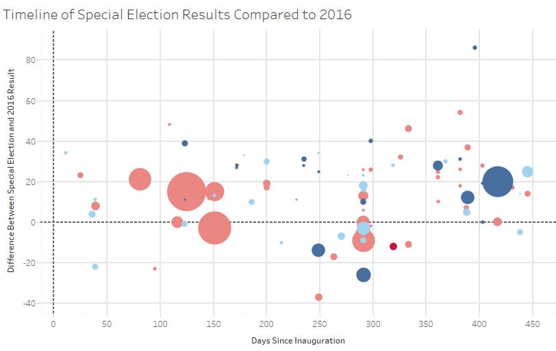
You might have seen this graphic before in my previous posts (skip this description if you have or if you’re uninterested in the graphic). It’s a timeline that compares the results in each special election to the 2016 result. Each bubble is an election, and the color indicates which party won it (light red is a Republican hold, light blue is a Democratic hold, dark blue is a Democratic gain) and the graph reads left to right chronologically. The vertical positions shows what happened in the election compared to 2016: Points that are farther above the dotted line indicate greater Democratic overperformance compared with Hillary Clinton, and points below the line indicate that the Republican outperformed Trump. The point size is proportional to the total number of votes cast for major party candidates, and only House and state legislative special elections are shown.
Recommended Stories


There are a few key takeaways from this data.
First, special elections have been quieter in the last month (no party has flipped a seat) but Democrats have still been outperforming their 2016 baseline. Daily Kos Elections has calculated that, on average from the beginning of 2017 to now, Democratic special election candidates in legislative races have beat their 2016 margin by 13 points. Last Tuesday’s results in Iowa’s 25th state senate district and last week’s results in Rhode Island’s 8th state senate district were almost exactly on that average, with Democrats improving on Clinton’s vote by 14 points in each race.
Second, the baseline matters. Look at this graphic: It’s tweaked so that the special election margins are compared to Obama’s margin in 2012 instead of Clinton’s in 2016.
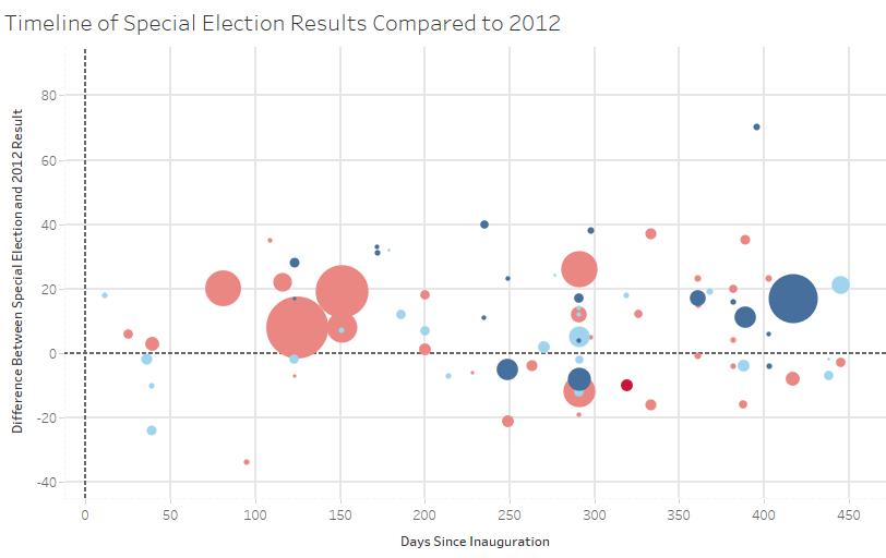
The overall message of the graphic (that Democrats are, on average, outperforming previous election results) is the same. But the narrative about some key races changes completely. One of the big points near the 150-day mark (Georgia’s 6th district special election) goes from a race where Karen Handel outperforms Trump’s margin in beating Jon Ossoff and gives the GOP hope for 2018 to one where she strongly underperforms Mitt Romney (who did much better than Trump in that well-educated suburban Atlanta district). Democratic overperformance in South Carolina’s 5th District and Montana’s At-Large District also becomes somewhat less impressive. Some data points stay roughly the same (like Pennsylvania’s 18th District), but the exact contours of where Republicans are or aren’t losing support changes if you shift the baseline.
Third, to borrow from Jon Robinson, the variance is too damn high. As I’ve noted previously, Republicans have underperformed Trump by as much as 86 points and overperformed him by as much as 37 points in various Trump-era special elections. There’s a lot of noise in this data, and you should be skeptical of anyone who zeroes in one special election without giving any sort of broader context. Republicans can cherry pick points from this dataset to argue that they’re in good shape for the midterms (e.g. Georgia 6th District) and Democrats can grab onto legislative results that exaggerate their (very real) midterm advantage.
You can take this a step further if you want to. As I noted in my preview of the upcoming congressional special election in Arizona’s 8th District, it’s possible to nearly obliterate all our data from Trump-era special and off-year results by airing reasonable gripes about individual data points. State legislative data is noisy. Some House special elections featured less than stellar Republicans (like Montana’s new congressman, who body-slammed a reporter, or Ron Estes who was tied to an unpopular governor in Kansas), and the Alabama senate special election certainly featured Roy Moore, a uniquely terrible candidate. I could go on, but you see the point: You can carve up our data from Trump-era elections a thousand different ways, or find ways to chuck almost all of it.
So don’t spend too much time creatively carving up the data. And don’t ignore it altogether. Just compare the results to an appropriate baseline (like Trump’s performance or partisan lean), average it and look at the data in the context of important polls like presidential approval and the generic ballot. And a coherent picture emerges from that data: that Democrats are going to make big gains in the 2018 midterms, probably taking the House and possibly the Senate as well.