The New York Times, the motto of which is “All the News That Fits Our Ideology,” is at it again. The same historical geniuses who brought us the 1619 Project are back with another go at bending American history to fit The Cause. This time, they’re out to redesign Old Glory for our new and inglorious age.
“The Stars and Stripes is iconic,” the New York Times declares, “but the American flag used to change frequently.” This is both strictly speaking true and laughably bogus. If by change the New York Times means the addition of a star every time a new state was added to the Union, well, that is change. And yes, there used to be some improvisation as to the arrangement of stars. But to claim, as the New York Times does, that those modest modifications amount to remaking the Star-Spangled Banner at will is silly.
But the New York Times repeats and repeats the assertion that it is nothing new to rip up and replace the national flag: “Its design shifted frequently until the early 1900s,” the Gray Lady claims. And, “For nearly 250 years the American flag has been made and remade, evolving from a unifying emblem into a complex and contested vocabulary of symbols.”
Given this supposed malleability of the nation’s standard, the New York Times suggests it’s time to redo the flag altogether, an exercise in “exploring bold ideas to revitalize and renew the American experiment.” The paper turned to a gaggle of artists and graphic designers to come up with flags for people whose first instinct upon seeing the Stars and Stripes is to reach for matches. There is a flag with, yes, red, white, and blue, but also yellow, to represent “repairing systemic racism,” and green, to symbolize “taking care of our planet.”
Or how about a dingy white “monochrome flag” to represent “America surrendering to its fall from power and loss of the ideals it once stood for?”
While we’re making alterations to iconic imagery, it would seem a propitious time to revisit the emblems of the New York Times itself, to rework the vocabulary of symbols in the paper’s nameplate, an iconography that New York Times muckety-mucks have declared to be “highly effective signifier[s] for our company.” And so, I turned to Washington Examiner magazine designer Philip Chalk to freshen up the look of the New York Times. He created a set of subtle improvements we have chosen, in the spirit of clear and honest visual presentation, to make available to the New York Times gratis.
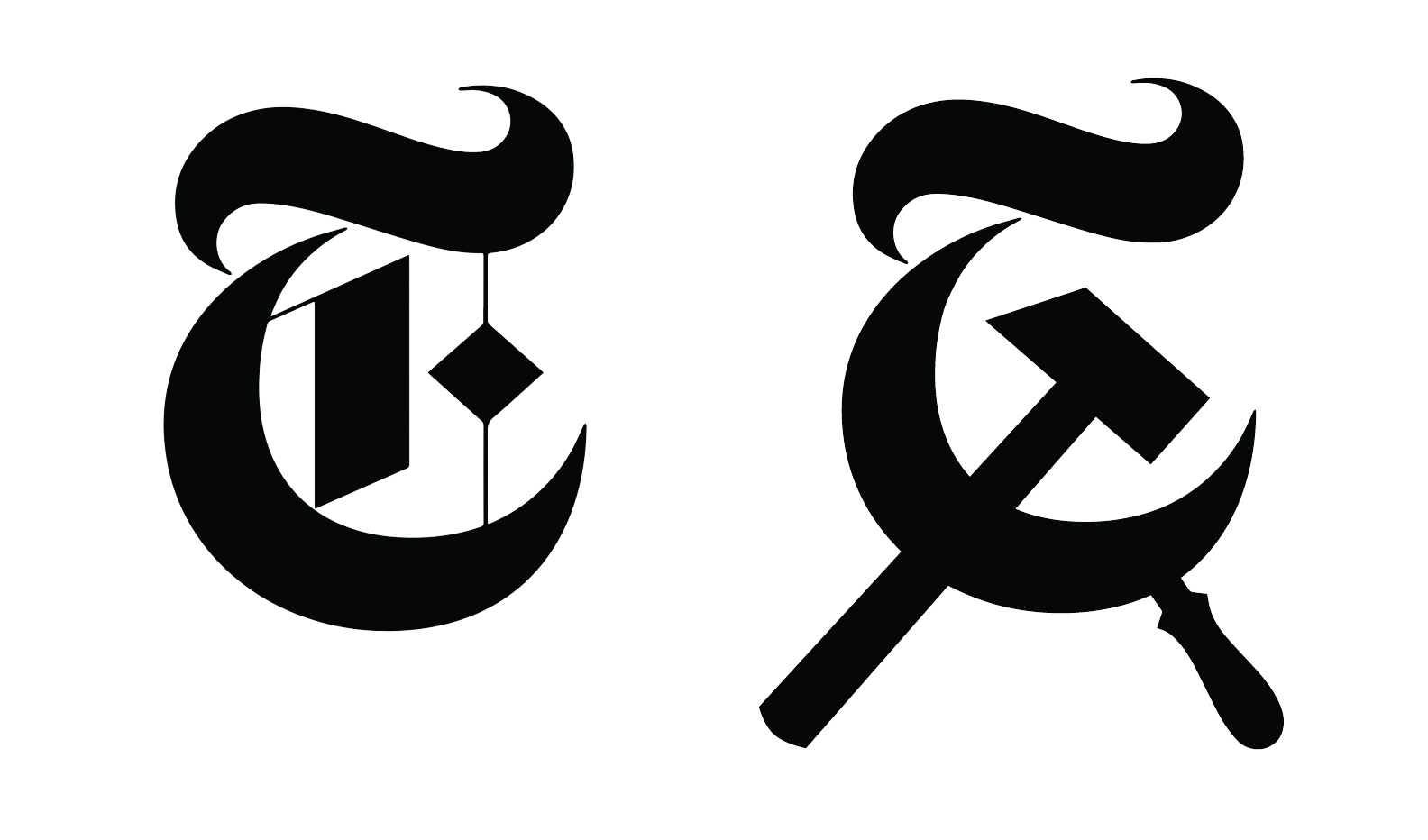
Let’s start with the simplest of the New York Times’s visual elements, the free-standing capital T used widely online as a hip brand icon. Mr. Chalk has touched up the T to make the New York Times brand identity as clear as possible.
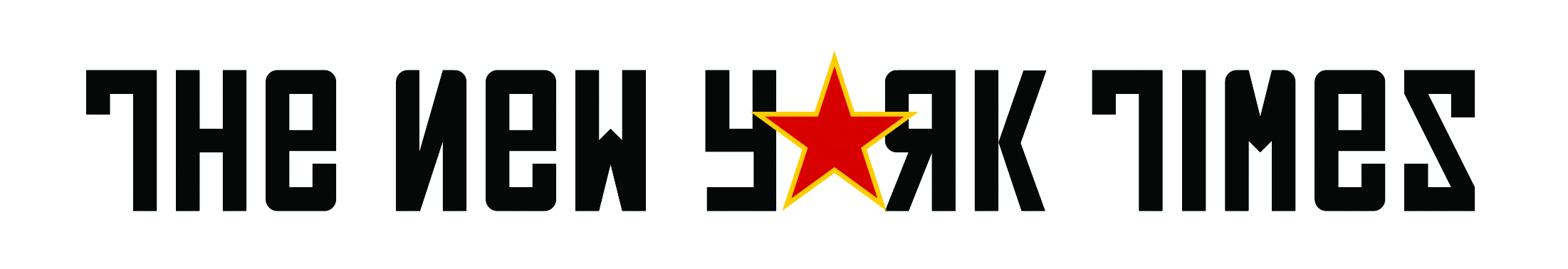
But what about the banner that runs across the top of page one? The whole Gothic thing is awfully tired these days. And so Mr. Chalk devised this next treatment, an homage to the enduring legacy of Pulitzer Prize winner Walter Duranty.
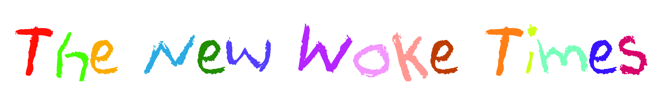
Or how about this suggestion, a nameplate that is colorful, cheerful, and gets across the fact that the children are in charge of the nursery?
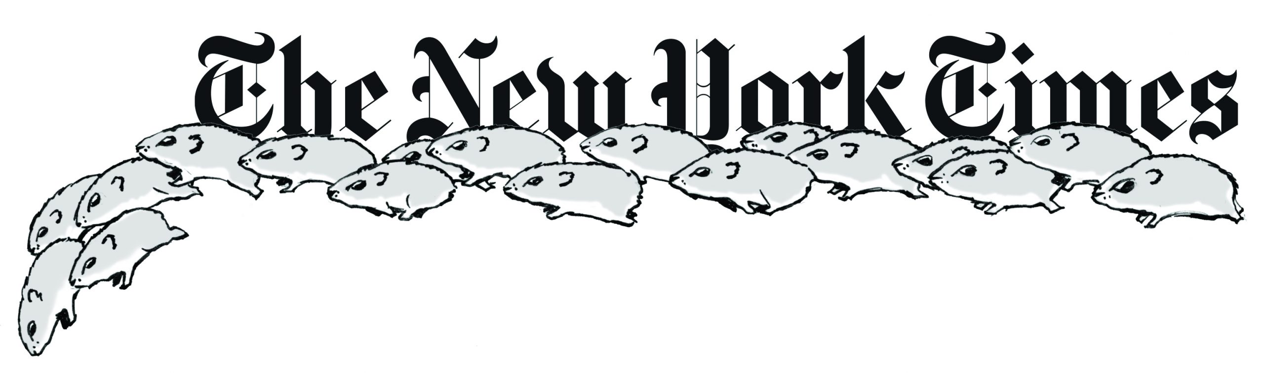
Perhaps the most evocative use of the New York Times title is this last one — a nameplate appropriate for the paper’s “It’s Later Than You Think Edition” — a springboard for lemmings, a jumping-off place if you will. No doubt they are sophisticated lemmings, the sort that scratch out a living as adjunct lecturers in cultural agronomy at Des Moines Area Community College. Go, lemmings, go!
As for the American flag stunt, I can’t get myself too worked up. After all, it’s nice of the New York Times, illuminating, really, to make crystalline its contempt for the symbols Americans revere and its contempt for the Americans who revere those symbols.
Just don’t try flying any dingy white surrender scrap over the Iwo Jima Memorial.
Eric Felten is the James Beard Award-winning author of How’s Your Drink?