The painter Trevor Winkfield was born in 1944 in Leeds, England, and moved in 1969 to New York City. There he became involved with writers, poets, and other painters from the New York School, including John Ashbery and James Schuyler. Winkfield’s paintings are in the collections of the Museum of Modern Art in New York, the Philadelphia Museum of Art, and the Berkeley Art Museum, among many other in the United States and abroad. He shows at the Tibor de Nagy, in Manhattan.
Winkfield is also the author of several books. Recently, he published a book in collaboration with the poet Charles North titled Elevenses, which is published by Granary Books in an edition of 30 copies, all of which are signed by the author and artist.
Recommended Stories


Trevor is a friend of many years. Over the course of several decades, and through the halls of many museums and galleries, he has done his best to teach me how to look at paintings, including his own, a few of which I proudly hang in my home. He is a master at explaining what makes great paintings great, how they repay careful looking, and how to appreciate the excellence of less-great, but very good, painters.
The imaginative world of his own paintings, inhabited by characters ranging from Egyptian gods, to roosters, to madmen, to famous poets, is an orderly delirium presided over by one of the brightest and greatest of palettes in contemporary painting. We talked recently about all of this and much else. Here is part one of our conversation. Part two will be published tomorrow.
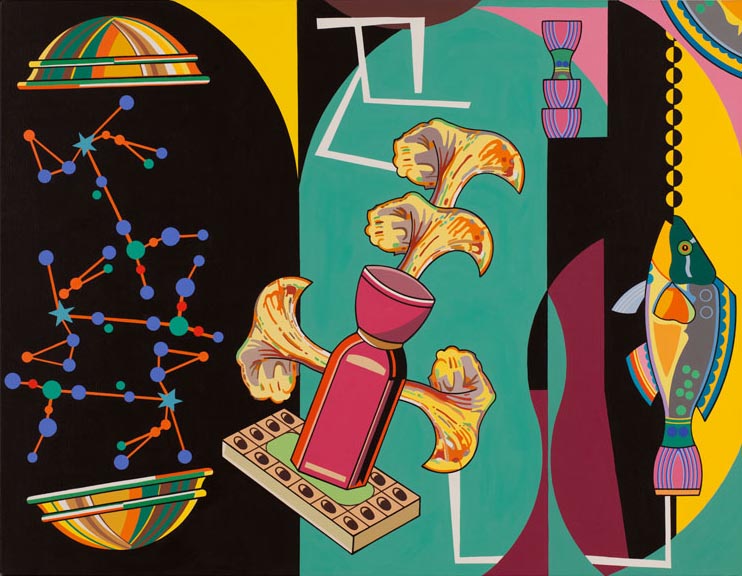
Lee Smith: Can you talk about your new book with the poet Charles North?
Trevor Winkfield: Charles and I often meet in uptown Manhattan around 11:00 a.m., buy a coffee and pastry, then head for a park bench for an amiable talk. Elevenses takes its title from this ritual—elevenses being the English expression for a mid-morning break.
As designer of the book, I tried to make the book look as much like a medieval manuscript as I could, using as many colors as possible . . . .and then some. I hope the effect is one of handling an object rather than just reading a book, with my saturated images complementing rather than illustrating Charles’ text, a text exemplifying our mutual love of journals, Dorothy Wordsworth’s above all.
LS: We first met when you were designing book covers, including one for a reissue of the poet John Ashbery’s Some Trees. Also, you’ve worked with writers and poets before, including a series of portraits you painted of poets, like Ashbery, Ron Padgett, and Doug Crase. What is it that you as a painter like about collaborating with writers?
TW: I began collaborating with writers because they were my friends, and our generation had an easy to-and-from between the art world and the literary world, to the extent that they often intermarried. Charles North, the poet I worked with on Elevenses, is married to the painter Paula North.
LS: You’re also a writer, and a poet, and a translator, as well as a painter.
TW: I’m not a poet, though I wrote poems and short stories immediately after leaving art college in 1967, and continued roughly through 1975. I wrote because I didn’t know how to paint the paintings I wanted to paint, but I found I could I describe the elusive painterly scenarios in words. And I found a new way to paint during that same period by studying, then translating Raymond Roussel’s expository essay “How I Wrote Certain of My Books,” which described the techniques he used in writing his very strange novels and plays. I found I could use similarly bizarre techniques to construct a painting. So from 1975 onwards I became a full-time painter. I never wrote another poem or story, since they had been only a means to an end. Neither was I tempted to translate anything else, ever. Translating is a total nightmare: I’d wake up at 3:00 a.m. having thought of another solution to a translation problem.
The only period where I’ve subsequently felt an urge to write was 1990 through 2005. Never having taught, I had all these ideas bubbling up inside me with no audience, at which point two very nice and sympathetic editors approached me for articles. Despite the travel perks, and the pleasure of seeing my name in print, after I’d written about 20 pieces I realized I’d said more or less all I wanted to say, so I stopped. I think the problem with so many critics is that they go on writing too long—it becomes a job and not a vocation. Repetition sets in. And in my particular case, I felt that the attention span of audiences was changing. Web magazines and blogs were taking over, with a lot less space for expository articles, let alone personal viewpoints such as I expounded.
LS: As a young boy growing up in post WWII Great Britain, what were your earliest experiences of art?
TW: The city of Leeds had an official coat of arms, which I seem to recollect was emblazoned on a lot of municipal vehicles trundling around our neighborhood. It was probably my first experience of everyday Surrealism, since the coat of arms depicted a central blue shield displaying a golden fleece suspended from a belt, with a black band above it holding three silver stars. But what made it especially strange was the fact that the shield was supported on either side by owls wearing ducal coronets, and nestled on the shield itself was a shiny silver helmet streaming ribbons. And balanced stop that was another, smaller owl. A pyramid of nonsense. None of it made any sense to me at the time, and even though I later discovered the reasons for each piece of symbolism, I initially revelled in its apparent ambiguity. You can barely go five miles in England without running into yet another castle or ruined monastery, so by hopping onto my bike I discovered lots more heraldry in the surrounding countryside and neighboring towns. It didn’t take long to find out that heraldry had its own exotic terminology —azure, couchant, proper, gorged, engrailed, chevron, fess, shakefork, and so on. Very appealing to a schoolboy sleuth—a secret language to describe the bright, flat color fields I instinctively knew I wanted to emulate in my crayon drawings.
LS: But you didn’t go directly from crayon drawings to acrylic paint on canvas. What did you mean when you said that you had to find a new way to paint?
TW: The problem in a nutshell was how to stop being a student and how to become a full-time painter. I was a slow developer—it took me eight years to find out. I didn’t stop making art entirely—I made a few drawings for small magazines, plus a handful of paintings for friends’ birthdays. But translating Roussel’s essay (very carefully, as my French at that time was only a notch or two above schoolboy French) introduced me to a much wider world than the somewhat static one I was experiencing in London. My student paintings were essentially one dimensional, both literally and figuratively, simple objects against plain backgrounds. Moving to Manhattan in 1969 helped too. I’d never experienced so many overlapping occurrences as Manhattan had to offer. Has anyone ever noticed how many doorways there are in Manhattan? How many people emerge and disappear into them all the time?
A feeling of constant and unfocused busyness, with nothing static. This is what Roussel had to offer: a tumult of images, ever unfolding, one thing leading to another.
In a manner of speaking, Roussel could make a silk purse out of a sow’s ear. Something he taught me was that I could use something totally mundane to produce the most outlandish imagery. For instance, he phonetically distorted his shoemaker’s name and address, Hellstern, 5 Place Vendome, into “helice tourne zinc plat de rend dome,” which translates as “propeller turns zinc flat goes dome”—all the elements used in a complicated apparatus constructed by one of the protagonists in Roussel’s novel Impressions of Africa.
One lesson Roussel taught me was that you could extract complexity from simplicity. You could take anything simple—a business card—and squeeze from it several meanings, shapes and puns. One of my earliest painterly puns involved piling a heap of builder’s mortar atop a professor’s mortar board. An almost banal use of Roussel’s methods . . . but only John Ashbery got the connection. A general oversight that alerted me to the sad fact that most people don’t want to think when they’re looking at a painting.
LS: The way I look at paintings is how you’ve taught me to see them over the years: construction, composition, color, subject, etc. On Instagram I started posting pictures of details of paintings I photographed, which is how you taught me to look at paintings—break them down into smaller parts and look at them like that to understand how it was really made. But what do you mean here when you say most people don’t want to “think” when they’re looking at a painting?
TW: Well, it’s the difference between looking and seeing. Most viewers are tourists, and just look. Some stay and study a painting, and they’re the visitors, the ones who try to think about what’s going on. There again, some great paintings are just meant to be enjoyed. You don’t need to understand the religious symbolism underpinning most medieval altarpieces, for instance, and even when you do it’s no guarantee you’ll appreciate them any deeper than if you viewed them purely formally, as simple shapes and colors. But I’ve always been the kind of inquisitive viewer who needs to know why that particular martyr is hanging upside down on a wheel.
Curiosity is a way “into” a painting, and I’ve noticed that the more time one spends trying to read a painting, to think about what’s happening directly in front of your nose, the more secrets the painting will reveal. It’s like time spent getting to know another person—it usually repays the effort. For instance, a couple of years ago I attended a talk at the Frick Museum on an Antoine Watteau painting, Venetian Pleasures, that had been loaned from the Scottish National Gallery.
It was a painting I thought I knew well—I’d studied it in Edinburgh a year or two earlier. This talk took place in front of the painting, and I managed to position myself directly in front of it. My nose was 12 inches from the surface for the better part of an hour. That close, and with that amount of time to scrutinize, I began to find things I’d never noticed before: how lascivious the white female statue looked, and how she seemed like a real woman who’d been doused in whitewash. The incredible amount of sexual tension generated between the assembled couples via their glances, the way in which one woman ignores her potential seducer to focus on the dancer in the foreground. The delicate coloration of her clothing offset by the gray garb of the man next to her.
All this taking place in a few square inches—incredibly economical. Other paintings, as I’ve mentioned, don’t need that much scrutiny. Mondrian’s surfaces are scrumptious enough without theorizing (whatever you do, never read his writings).
LS: You can read the second part of our interview here.