President Donald Trump’s approval rating is probably the most important number in American politics right now. Midterm elections are essentially referendums on the president and his party, so his approval rating will tell us something about what’s going to happen in November. Given that Trump is currently the center of the political universe, t’s hard to understand the ups and downs and the news cycle without having a firm grasp of how the presidntial approval rating works.
I decided to take a long, graphics-driven look at Trump’s approval rating. I used a large dataset of polls (FiveThirtyEight’s polling sans tracking polls) and some un-scary math to try to get a sense of when Trump’s approval changed over the last year and a half. I then marked some important political events on that trendline and tried to see what conclusions jumped out of the data (note that this article is sort of a more graphics-heavy sequel to something I wrote in November of last year).
Here’s what I found:
Domestic Policy Explains a Lot
Most of the up and down movements in Trump’s overall approval rating coincide with major domestic policy events, though not all domestic policy events matter. You can see what I mean by taking a look at this graphic.

The lightly shaded dots are individual polls (chronologically they run right to left, and vertical position indicates Trump’s approval rating in that poll). The red line is a trendline (a generalized additive model, which attempts to get a trendline with the right level of smoothness), and the black dots mark specific events.
Trump’s first major legislative push was on health care. The president supported various efforts by the congressional GOP to repeal and replace the Affordable Care Act, but none of those attempts were very popular. And as the process moved along (one bill failed in the House, another passed and another version of the law failed in the Senate), Trump’s approval got worse. More sensitive trendlines show a larger drop after the final version of the bill (skinny repeal) failed, but you can still see a small downturn in this graphic.
Tax reform was initially unpopular, but it got more popular after it passed. It’s possible that, by signing that bill, Trump won back the support of some Republicans. Maybe more importantly, some of the tougher stories for Trump (i.e.,health care fights, Roy Moore) left the headlines. That may have allowed Trump’s approval to float upward toward a more natural (but still low) equilibrium.
It’s also worth noting that not all policy pushes ended up hurting Trump’s job approval. The trendline suggests that Trump’s approval numbers didn’t dive or rise in response to his family separation policies or the immigration policy pushes. And that makes sense, because there’s evidence that events (even important ones) that don’t get sustained coverage sometimes don’t end up moving the needle.
Duration and Volume Matter
The content of the news seems to matter (e.g., if Trump is pushing for an unpopular policy, his approval rating can suffer). But important events that have a limited duration or compete with other events don’t always end up making a mark.
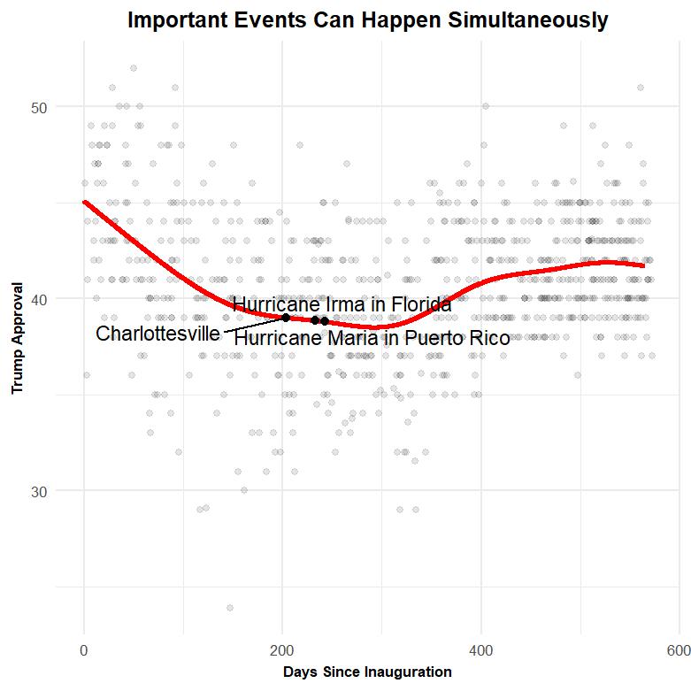
This graphic shows three events: the white supremacists’ rally in Charlottesville in 2017, Hurricane Irma initially hitting Florida, and Hurricane Maria hitting Puerto Rico.
Voters strongly disapproved of Trump’s handling of the violence in Charlottesville, and the Puerto Ricans are still dealing with the aftermath of Hurricane Maria. But these news stories didn’t have as much sustained exposure as some of the longer-running stories like the health care debate, which may have blunted their ability to move the topline number. And it’s possible that overlapping news stories sort of cancel each other out. Voters seemed to approve of Trump’s actions in response to Hurricane Irma, but the effect of that may have been outweighed by the debacle in Charlottesville and/or his handling of Maria.
In other words, if an event or news storyline doesn’t receive sustained coverage or has to compete with other more important stories, it may not end up moving the topline number.
Russia: The Complexities of Cause and Effect
This sort of causal relationship—one where a specific event leads to an immediate uptick or downtick in Trump’s approval rating—matters now. We’re closing in on the midterms, and a short-term boost or drop in Trump’s approval rating could have significant effects on how the GOP fares. But it’s not the only way to think about Trump’s overall approval rating.

This graphic shows a few of the key events regarding Trump, Russia, and the investigations surrounding his 2016 campaign. Flynn’s resignation came in the early days of the Trump presidency. So it’s hard to distinguish any effect that Flynn had from the natural waning of Trump’s “honeymoon” period. But it’s easier to make the case that the Comey firing (along with some of the other stories we’ve already mentioned) helped push Trump’s approval downward in the first months of his presidency.
Yet other key moments—like the discovery of Donald Trump Jr.’s meeting with the Russians and the Helsinki summit between Tump and Putin—aren’t followed by a big rise or drop in Trump’s approval. Moreover, we can explain most of the movement between those stories without invoking the myriad of Russia-related events that happened in the interim.
That doesn’t mean the Trump-Russia story is unimportant or just noise.
When we talk about Trump’s approval rating, we shouldn’t just look at movements—we should also think about why his approval rating is at the level it’s at. You could argue that the constant cloud of Russia allegations is pushing Trump’s overall approval downward and that he’d be more popular if none of this had ever happened. You could also argue that his personality is an issue—that if he tweeted less and was more traditionally presidential, that he would be more popular. Or you could argue that if he focused on the economy instead of getting caught up in cultural fight—you get the point.
Causation is complex, and storylines or events that don’t immediately change the topline number might still have influence. And sometimes storylines have little effect for a long time but eventually hit a tipping point that changes everything (think of the straw that breaks the camel’s back or the moment the Jenga tower comes down).
But these graphics suggest that Trump’s approval rating is mostly stable, and that long-term policy stories have some ability to move Trump’s numbers. This is far from the final word on this data— you could draw a different trendline or fit a different set of events on top of it (God knows there have been more than enough news events to do that many times). But it suggests that a lot of Americans have made up their minds about Trump, and that the news roller-coaster of the spring and summer of 2018 didn’t make a huge mark on Trump’s approval rating.