Out on the Twitters, people have been generally down on Hillary Clinton’s 2016 campaign logo. The New York Times’s Nate Cohn said it looked like a hospital sign. Others suggested it looked like the Cuban flag. Or the Fed-Ex brand. Box CEO Aaron Levie said it looked like it was drawn with MS Paint. (Oooooo! Burn!) The self-righteous whiners at Wikileaks accused her of stealing their logo. The logo got its own Twitter account. (Which is 98 percent less funny than Obama’s Teleprompter.)
Even so, the new log tells us something about the kind of campaign Clinton is going to run.
(1) She’s using Obama 2008 as her model.
Have a look at Clinton’s 2008 brand. It’s a classic presidential logo, almost indistinguishable from John Kerry’s 2004 effort or any of the logos of people running in 2000. Dark blue, red accents, white text. Hillary 2008 might as well be every presidential logo from the last fifty years. (The site 4president.org helpfully catalogues presidential campaign logos going back to 1960. It’s a repository of awesome.)
The eureka moment in presidential graphic design is Obama’s 2008 “O” which jettisoned the entire campaign color palette and presented softer hues while reducing the candidate to a single, iconic letter which was its own visual motif.
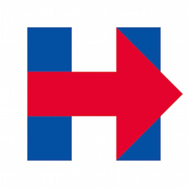
Hillary’s H-> is a direct effort to copy Obama’s branding: A single letter with a visual element (Obama had the red striped road; Hillary has the arrow), and a non-traditional different color palette.
(2) Hillary 2016 will be a cult of personality.
One of the reasons Obama’s “O” was so successful was that it was perfectly in-sync with his campaign, which was a cult of personality. Bill Clinton didn’t need a fancy piece of graphic design in 1992 because he was running a policy-heavy race with a specific view of America’s future. (People forget how policy-wonkish Clinton was as a candidate; his appeal wasn’t just his charisma.) Obama, on the other hand, ran as an empty vessel promising voters that “they were the one’s they’ve been waiting for” and offering himself as a stand-in for everyone’s nebulous “hope.”
Traditionally, campaigns use arguments or visions to drive their campaigns. Obama was his campaign, and his logo emphasized that.
Hillary’s new logo suggests that the lesson she learned from 2008 is that a cult of personality is a powerful force. Hence the H-> and the insanely Orwellian “We Are Hillary” mission statement.
(If you are Hillary, then how much does Goldman pay you per speech?)
(3) Things could get weird.
You remember the Shepard Fairey “Hope” posters, of course. It would be fine if pop art swung behind Hillary. Maybe some ingenious artist might morph her into Eleanor Roosevelt the way Ron English Frankensteined Obama and the Rail Splitter. Or turned her into Robin Hood. Or even into a vaguely Maoist Dear Leader. I mean, we can all deal with that.
But if we get into Hillary topless unicorn riding or doing Xena Warrior Princess-type exploitation well—just remember, there are some things you can’t un-see.
(4) Democrats can’t quit Howard Dean.
Note the tag line on Clinton’s site: It’s “Hillary for America.” Not for president—because a simple office with a finite term is too small and pedestrian. No, it’s for all of America.
This has been a conceit of Democratic campaigns since Howard Dean used it in 2004. Everyone else was running for president. Dean was running for America. Obama ditched the “for president” and was simply “Obama.” Clinton is back to the more expansive formulation. It might be a while before another Democrat runs simply “for president.” It’s just not grand enough for a cult of personality movement.
(5) Republicans are evolving their graphic design priorities, too.
Look at the current crop of logos and compare them to what Republicans used just eight years ago. It’s a sea-change. Rand Paul has the strongest design of the new crop, but even his brand isn’t as striking and powerful as Clinton’s. Rubio’s is terrible—all lower case, a darker, almost maroon color scheme, with a nonsensical use of a map as the dot in the “i.” But he’s abandoned the conventional designs, too.
We’ve now undergone a complete revolution in presidential graphic design and there’s no going back.