If you want people to keep being okay with lockdowns, don’t make them feel lied to.
Those of us outside of the New York area have done exactly what we were told we had to do. We “flattened the curve,” and now we’re being told that this flattened curve is a sign of our failure and a reason we need to stay in lockdown.
Unless you want to demolish all faith in public health authorities, don’t make them into liars by moving the goalposts and declaring that a flattened curve is a sign of failure. It would be even worse to poison this with partisan politics by asserting that the government leaders who totally failed to flatten the curve, and then who spread the virus to the rest of the country, are success stories.
It reeks of culture-war politics against Middle America.
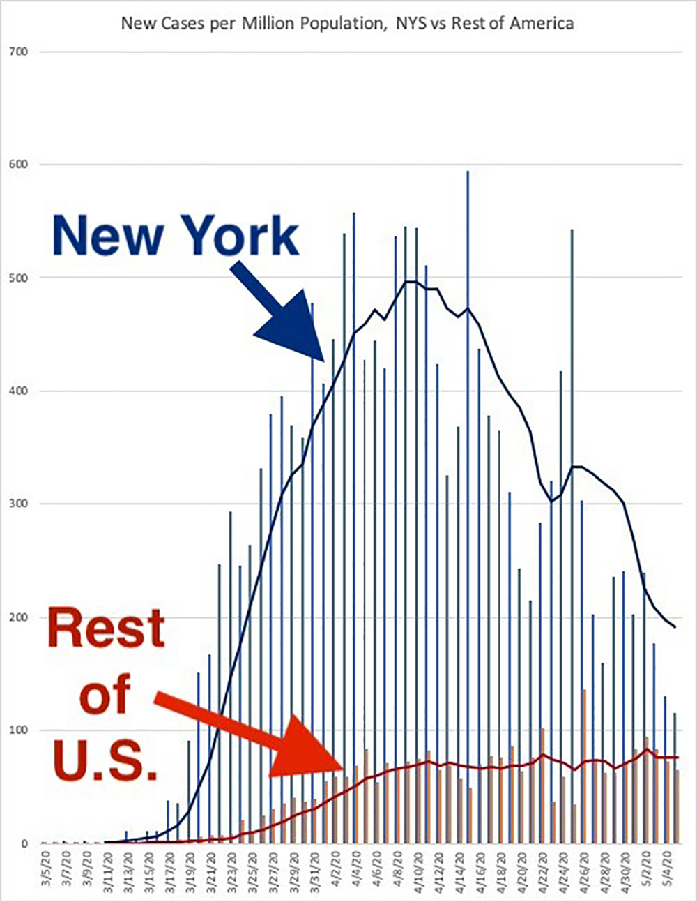
This chart at Axios seems to make the point that New York state and the Europeans have turned their ship around, while the rest of America hasn’t.
Even Italy and Spain — hard-hit countries that had been seen as models of what not to do — got their new coronavirus infections to start going down before they reopened.
The U.S. hasn’t done that. https://t.co/MiJUdc1xok pic.twitter.com/Ny7W7D2uMm
— Sam Baker (@sam_baker) May 7, 2020
Here’s the same sentiment from a set of charts by the New York Times.
Coronavirus cases falling in the greater NYC but rising in the rest of the US. pic.twitter.com/NfQ7VMcs5h
— Michael Li 李之樸 (@mcpli) May 5, 2020
The data actually suggest, however, that the rest of the United States has succeeded at the assigned task, while New York has failed. That is, the U.S. minus New York has flattened the curve.
Both of those above charts mislead by not adjusting for population. The rest of the U.S. (not every single part, but the country, in aggregate, minus New York) has had a much slower rise. We may or may not have hit a peak. The peak will be later than in New York, Italy, or Spain, precisely because we flattened it.
Here’s the chart we were given a thousand times to explain to us why we needed to close schools, lose our jobs, cancel T-ball, and stop going to church. This is the version from the Centers for Disease Control and Prevention:
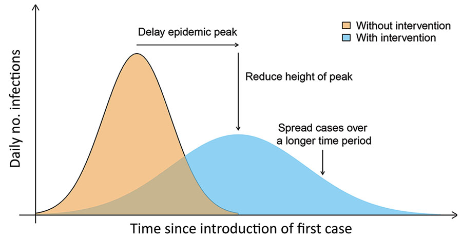
You’ll notice that the success case (the blue, flattened curve) is still rising, while the failure case (the big beige spike) is falling from its very high peak.
Now take the data from that Axios chart or that New York Times chart but adjust for population. Here’s what you get:
Look familiar?
Even if you assume that the rest of the U.S. is really on the rise, it still looks like New York is what happens when you don’t mitigate the spread, and that the rest of the country is a flattened curve.
This could be what we’re looking at:
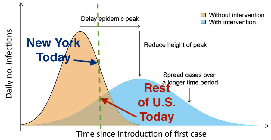
We’ve done it. We (except for you, New York) have flattened the curve.
This is not a case for ending all lockdowns. It is a case for ending unneeded lockdown measures (thanks Gov. Larry Hogan for allowing fishing as of today) and slowly opening up society.