A dive into the current economic outlook, with real GDP growth slowing from the rapid 3.8 percent pace registered in 2018’s first half to a now-tepid 2.5 percent, points to at least two troublesome factors: President Trump’s ongoing trade wars and rising interest rates. Of the two, trade war policy is the most troublesome, and state data can help tell us why.
The Federal Reserve has been promising interest rate increases for more than a year, but trade war policy decisions are fluid and harder to gauge; there is no coherent program that identifies when, why, and with whom trade wars will start and stop. Trump seems to prefer taking a more chaotic approach when negotiating with trade partners.
Recommended Stories


Complicating the issue is that it takes time, perhaps as long as a year, for changes in economic policy to show themselves in economic performance data. Those of us who sift through this data in the hopes of determining what’s really going on have to wait. Even after waiting, it is seldom the case that one observed trend can with complete assurance be attributed to a single policy action.
In short, the world economy is a huge, complex process. Nonetheless, we can make some informed inferences.
In any case, people like me who are concerned about a slowing economy should look to the Federal Reserve Bank of Philadelphia’s monthly state leading indicator maps. They project state-by-state economic conditions six months into the future based on key metrics like housing permits, initial unemployment benefit claims, delivery time for goods produced by manufacturers, and the spread between short- and long-term interest rates.
Here I provide the most recent map for September 2018, along with August 2018 for comparison. The August map shows most U.S. states west of the Mississippi River in dark green, denoting highest future growth. But just 30 days later, in September, a number had turned to a paler shade of green, which indicated dimmer future growth.
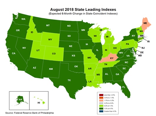
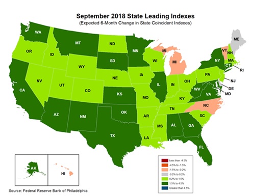
Across the map, the added slow growth states include Iowa, Nebraska, North Dakota, and South Carolina. The first three laggards are heavy grain exporting states; South Carolina is a heavy exporter of manufactured goods.
In August, there were two pink states, which projects a zero future growth rate: Kentucky and Maine. In September, Hawaii, Michigan, and North Carolina turned pink, though Kentucky recovered and turned green and data for Maine were incomplete. Two of the newly added states, Michigan and North Carolina, are heavy exporters of manufactured goods.
So, among other insights, these maps offer evidence that U.S. prosperity prospects are diminishing a little. The count of pink states is currently the highest for the year, up from just one in March and two in June. The maps also tell us where the slowdown is likely to be largest: agricultural and manufacturing states. These industries are especially reliant on exports, linking the slowing economy to the Trump administration’s chaotic trade policy.
What can we infer? Trade wars, which are man-made, are generating a weaker, hesitating economy and making us poorer. Now is the time for trade peace.
Bruce Yandle is a contributor to the Washington Examiner’s Beltway Confidential blog. He is a distinguished adjunct fellow with the Mercatus Center at George Mason University, dean emeritus of the Clemson University College of Business and Behavioral Science, and a co-author of September’s “The Economic Situation” policy brief.