

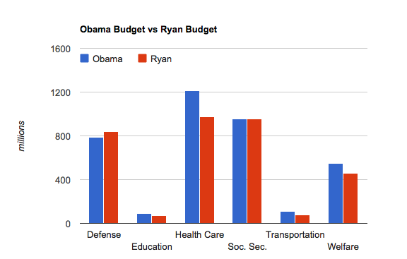
Brad Plummer has a piece up at The Washington Post purporting to explain “What Paul Ryan’s budget actually cuts — and by how much.” But besides some scary sounding factoids like, “Compared with Obama, Ryan would spend 25 percent less on transportation,” Plummer’s post doesn’t give a real good big picture comparing the two budgets (where are the charts?).
Below is a chart comparing the 2016 federal spending levels, as estimated by the Congressional Budget Office and the White House, of both the Obama and Ryan budgets.
Stay informed.Stay ahead.
Join Washington Examiner for unlimited access to the news, analysis, and commentary that matter most.
See Options
Already a member? Log in
Already a print subscriber? Click here to login/register your account
