Everyone who follows 2018 election news has seen this three-part news cycle play out:
“Republicans are surging in House polls!”
“Wait, now Democrats are getting some good polls!”
“Everything is back to normal—I guess it was all noise!”
And right now, it looks like we may be on the back end of another round of this. Republicans have gotten some good generic ballot polls over the last week (which are basically surveys that ask a national sample of voters whether they’ll vote for Democrats or Republicans in the upcoming House elections), but pollsters like CNN and Quinnipiac have just released some good results for Democrats. And the major averages like RealClearPolitics and FiveThirtyEight agree that Democrats are back to a lead of roughly seven or eight points—about where they’ve been for much of the Trump era.
So why do we keep going through this weirdly predictable media cycle?
There are the obvious human reasons. If the generic ballot was really shifting to the right, the analyst who spotted that trend first and found a reasonable way to explain it would gain readers and earn praise from their peers. That’s not a bad thing—we’re all trying to figure out how politics works in the Trumpera, and examining and theorizing about new data is a key part of that process. There’s also a (bad, in my view) market incentive to write short, context-free, clickbait stories (Plummet! Surge!) on new polling.
But these news cycles aren’t all market forces and human nature. There’s real mathematical, maybe even philosophical, reasons that the same news cycle keeps happening. We can get a handle on this by doing some basic (unscary) math (note that I talked through these issues in a somewhat different way last time there was an ephemeral GOP surge).
The first step is to look at the raw data.
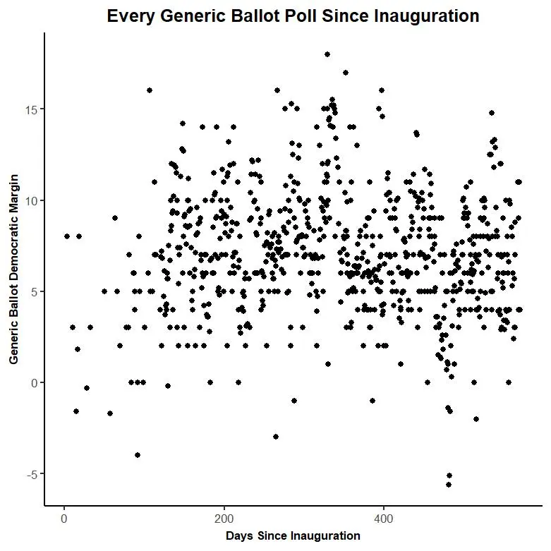
This scatter plot shows all generic ballot polls (excluding tracking polls) collected by our friends at FiveThirtyEight as of Thursday morning. Each point is a poll. The graph pegs Inauguration Day as Day Zero and moves chronologically left to right. The vertical position shows the Democratic margin—polls where Democrats have a bigger lead are higher up on the graphic, and polls where Republicans lead are below the zero line.
You can make out some trends in this raw data, but it’s sort of like a Rorschach Test (those are those ink blots that always look like your parents fighting). Ten different people could look at that data and each draw a different line.
That’s why statisticians have tried to invent mathematical schemes that allow you to draw objectively “good” lines through the data.
The simplest (and one of the worse) ways to draw a line through the data is to take a simple average over the entire timespan.
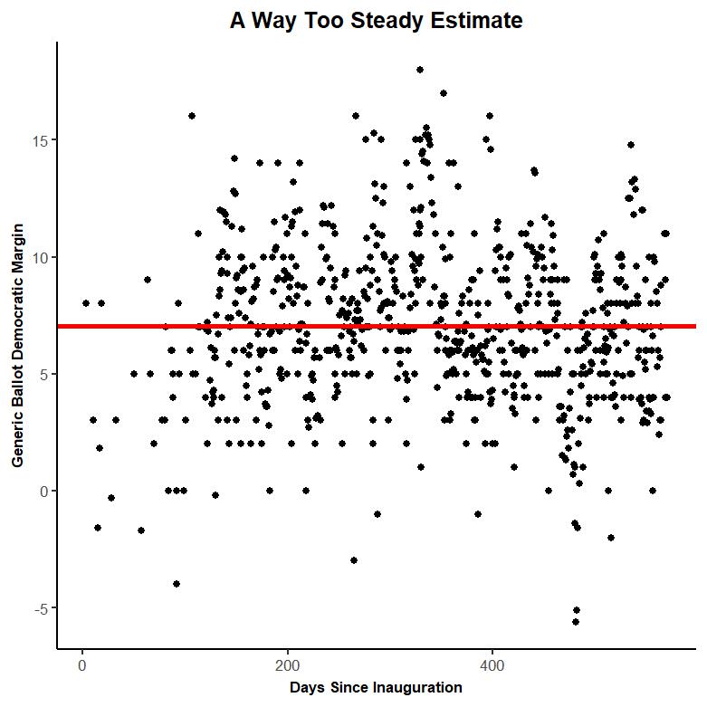
This line gives us a sense of what a normal poll in the Trump era looks like (a roughly seven-point Democratic advantage). But it doesn’t react at all to changes over time.
Another (still not great but illustrative) way is to take a simple five-day average.
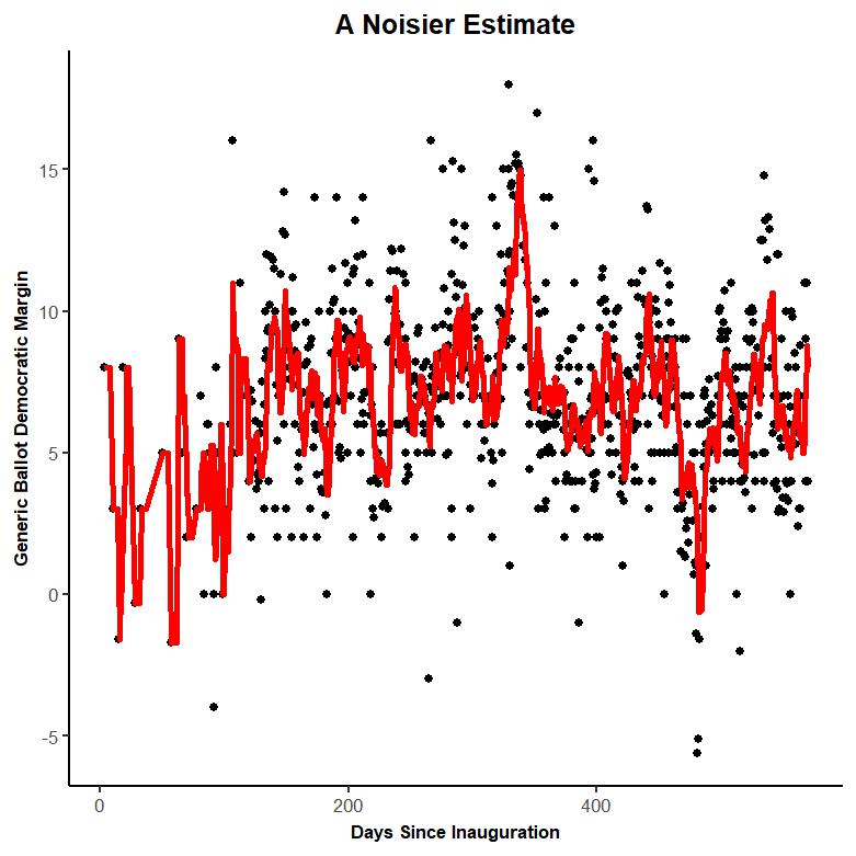
There’s a trade-off here. Unlike the first graphic, this trendline moves and catches some of the real changes in public opinion. But all polls have some amount of random error attached to them, and the second trendline chases that noise and sometimes loses track of what the data is saying.
And that tradeoff drives some of the “outlier poll –> frantic news coverage –> return to normalcy” news cycles we’ve seen this year. Some are more willing to think of public opinion in a squiggly way, to accept the risk of overreacting to new data in an effort to spot trends early. I don’t think there’s a necessarily right answer in this trade-off. In a way, it’s a values question. And both perspectives work if you don’t take them too far.
But some answers are better than others, and we can use math to get at some of the better answers.
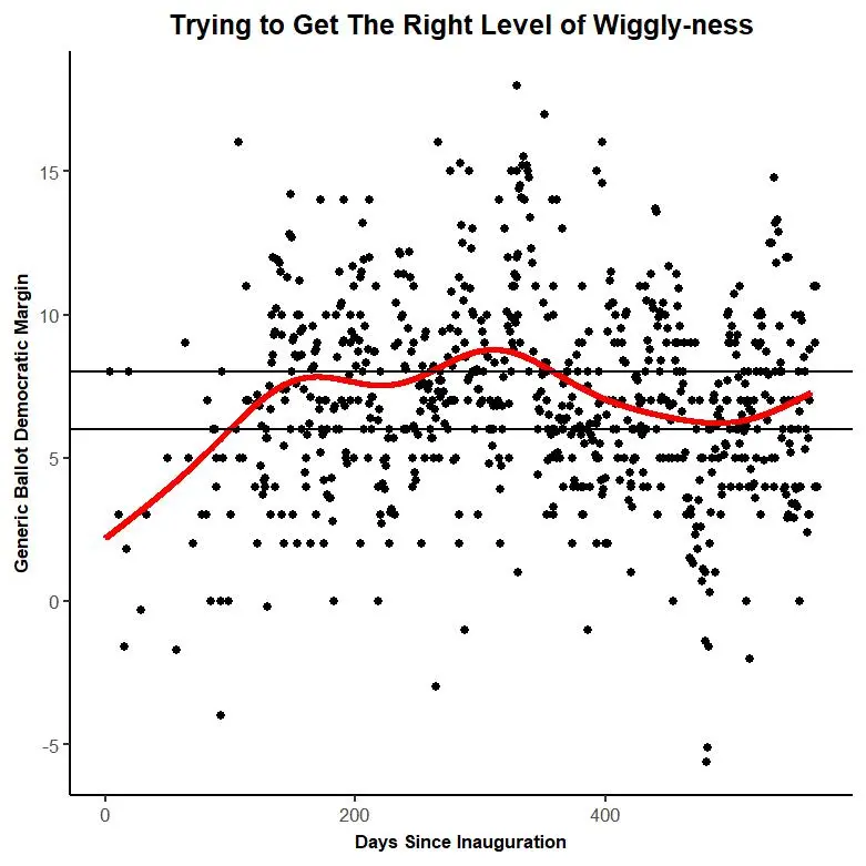
This is a GAM (a generalized additive model with tracking polls down-weighted—stats details here). Basically it uses complicated math to try to get the best of both worlds: to balance wiggly-ness with consistency and get at what the data is actually saying.
And the GAM paints a clear picture of what’s going on in public opinion. So far, it doesn’t see a surge for the GOP (now or earlier this summer).
The generic ballot plummeted as Trump’s (short) honeymoon period ended, and settled between six and eight points (the horizontal black lines) for much of 2017. Toward the middle-to-end of 2017 the GOP lost ground, but they regained it in 2018 and Democrats have held a six to eight lead for basically the entirety of 2018. These trends make sense—congressional Republicans had a rough fall and winter of 2017 (pushing an unpopular Obamacare replacement took its toll, and the tax-reform bill became more popular after it was passed in December), but since then Trump’s approval has moved upward a bit and they’ve been out of the news. That let the trendline settle out to something closer to a seven point advantage for the Democrats.
This GAM trendline suggests that, despite the insane roller-coaster of political events we’ve seen over the last 18 months, public opinion has been relatively steady.
This trendline isn’t perfect. Someone could create a perfectly reasonable trendline that’s twitchier or steadier than this one. Moreover, my GAM doesn’t take in factors (past pollster accuracy, sample size, which polls come from the same pollster, etc.) that other trendlines might.
But the trendline doesn’t have to be perfect. It’s a reasonable read of the data, and it suggests that, once again, there hasn’t been a sea change in the topline House numbers.