In June 2018, THE WEEKLY STANDARD unveiled SwingSeat, a Senate forecasting tool that used polls and other data points to generate probabilistic forecasts for every race (e.g. the Republican has a X percent win probability, the Democrat has a Y percent win probability) and for chamber control every day. And now that Cindy Hyde-Smith has officially won the special Senate runoff in Mississippi, we can get a sense of how the model performed and whether we accomplished our goals.
I’ll look through three areas: the accuracy of the topline numbers, the state-by-state probabilities, and the journalistic value of creating a forecast.
The Topline Numbers: We Predicted the GOP Would Get 52 Seats. They Got 53.
On Election Day, SwingSeat predicted that the Republicans would end up with 52 seats in the Senate. They ended up with 53. That’s not a lot of error considering that we’re talking about politics, an area where our best tools (polls) have real flaws and where there’s a lot of room for uncertainty and upsets (remember 2016?)
We also said that the Republicans had an 85 percent win probability, and we used various graphical tools to show the spread of possible results. In retrospect, the probability and spread generated by the model seems reasonable.
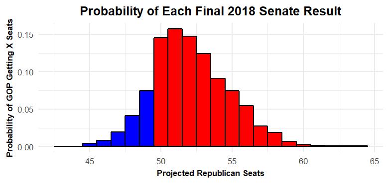
You might have seen this graphic—a histogram—in other SwingSeat pieces. Basically every bar in this graphic corresponds to a specific result (e.g. the bar above 50 corresponds to model simulations where the GOP wins 50 seats) and the height of each bar communicates the probability of that result according to the model (e.g. the bar above 60 is small because there was only a small chance the GOP would end up with 60 seats).
It’s impossible to say whether the Republicans truly had an 85 percent win probability. We can’t go back in time and re-run this election 10,000 times and see whether Democrats really managed to pull out a win 15 percent of the time. But the 85 percent number seems to track with what we know about polling and forecasting error from past elections, and the spread of results seems reasonable.
It’s also not hard to imagine realistic counterfactuals that fall within the sort of large middle part of the graphic. If things had gone somewhat better for the Republicans (e.g. Republicans had narrowly won West Virginia and Montana instead of losing by three and kept Arizona) the Republicans could have ended up with 56 seats. The model agrees that that’s plausible. Similarly, it’s possible to imagine a case where the polling was right in Indiana, things went south in Texas, the Florida recount went towards Nelson and one other surprise (maybe a polling error in Missouri or Tennessee) led to a Democratic Senate majority. That sort of scenario was always unlikely—the Democrats would have had to catch a number of different lucky breaks—but the likelihood was never zero. And I think that 15 percent chance captured the situation well.
State by State: Generating Truthful, Accurate Probabilities
The model also generated state-by-state win probabilities for every candidate. Here’s a summary of the final run of the model along with the results:
| State/Race | Republican Win Probability | Democratic Win Probability | Winning Party | “Correct” Call |
| Missouri | 56.5 | 43.5 | R | Yes |
| Indiana | 41.4 | 58.6 | R | No |
| Arizona | 40.6 | 59.4 | D | Yes |
| Nevada | 37.9 | 62.1 | D | Yes |
| Montana | 31.3 | 68.7 | D | Yes |
| West Virgnia | 18.1 | 81.9 | D | Yes |
| Florida | 16.1 | 83.9 | R | No |
| Tennessee | 84.5 | 15.5 | R | Yes |
| Texas | 91.2 | 8.8 | R | Yes |
| North Dakota | 95.2 | 4.8 | R | Yes |
| Mississippi Special | 95.2 | 4.8 | R | Yes |
| Ohio | 3.5 | 96.5 | D | Yes |
| Nebraska | 96.8 | 3.2 | R | Yes |
| Minnesota Special | 3.2 | 96.8 | D | Yes |
| Mississippi | 97.1 | 2.9 | R | Yes |
| Michigan | 1.8 | 98.2 | D | Yes |
| Wisconsin | 1.7 | 98.3 | D | Yes |
| Virginia | 1.1 | 98.9 | D | Yes |
| Pennsylvania | 1 | 99 | D | Yes |
| Maine | 0.6 | 99.4 | D | Yes |
| New Jersey | 0.5 | 99.5 | D | Yes |
| New Mexico | 0.4 | 99.6 | D | Yes |
| Minnesota | 0.2 | 99.8 | D | Yes |
| Utah | 99.9 | 0.1 | R | Yes |
| Washington | 0.1 | 99.9 | D | Yes |
| California | 0 | 100 | D | Yes |
| Connecticut | 0 | 100 | D | Yes |
| Delaware | 0 | 100 | D | Yes |
| Hawaii | 0 | 100 | D | Yes |
| Maryland | 0 | 100 | D | Yes |
| Massachusetts | 0 | 100 | D | Yes |
| New York | 0 | 100 | D | Yes |
| Rhode Island | 0 | 100 | D | Yes |
| Vermont | 0 | 100 | D | Yes |
| Wyoming | 100 | 0 | R | Yes |
It’d be easy to scan the table, look at where the model “called” the race correctly or incorrectly (i.e. when the candidate with the higher win probability won) and leave it at that. But that’s not the best way to think about probabilities.
Ideally, probabilities should be truthful—that is, if a model projects 100 different races each have an 80 percent probability of going Republican, about 80 of those races should be won by the GOP and 20 should be won by Democrats. It’s tough to come to strong conclusions about the truthfulness/calibration of our model with such a small sample size (35 races, only some of which are competitive). But the initial numbers seem to look good.
If you look take these probabilities at face value, you would expect the model to “miss” 2.8 calls. It missed two—Joe Donnelly was favored in Indiana and Bill Nelson was favored in Florida and both lost. In both cases, an upset wasn’t out of the question. Scott had a 16.1 percent chance of winning according to the model, and we should expect roughly one upset from the states that looked “Likely” but not completely solid for the leading candidate (Texas, Tennessee, Florida, West Virginia and Montana). Moreover, the model thought Mike Braun had a 41.4 percent win probability, so an upset was far from out of the question. In fact, there were four states that I would say “leaned” in one direction or the other (Arizona, Nevada, Missouri and Indiana). The probabilities suggest that there should have been one to two upsets in that category and there was one—Indiana.
Again, we don’t really have a large enough sample size to come to specific, firm conclusions about how well-calibrated the model was. But our Brier Score (more information on that here) is about 0.05 which is, I think, pretty solid in this context.
Overall, these results are encouraging. The model’s overall projections were close to the actual outcome and the state-by-state probabilities seemed to be helpful and communicate something real about the race-by-race uncertainty. I can’t take much credit for how accurate the forecast was—the pollsters did a great job this cycle, and that helped every forecast (ours included) get really close to the right outcome. But I think the model did a good job at what it’s designed to do—get new information, integrate it with a balance of caution and sensitivity, use that information to project results everywhere, figure out roughly how certain we should be of those projections and understand how these race-by-race results come together to create a chamber-wide forecast.
Journalistic Value: Telling Us Something We Didn’t Know
When I talk to people about the forecast, they sometimes ask me why I would make a forecast—that is, how doing a forecast improves journalism and the general public conversation. It’s a good question, and typically it’s asked sincerely. I have a few thoughts:
First, the model helps explain the horse race. If you think that the horse race is a legitimate, newsworthy topic, it’s easy to see how the model adds value. I’ve written many articles that use the model to summarize what we’ve seen from polling so far, talk about which data points should and shouldn’t change your assessment of a race and more. I think the model was most effective when we supplemented the forecasts with other information and zoomed in on a race—like when we used it to detect late tightening in Arizona, explain why Tennessee had moved toward Marsha Blackburn or get a firmer grip on the state of the race in overanalyzed Texas.
Second, the model helps explain how public opinion and our institutions interact. I think the best example of this is the controversy over Brett Kavanaugh. The Blasey-Ford/Kavanaugh hearings seemed to energize both Republicans and Democrats, and the model helped us sort out the details and figure out 1) which party the controversy helped 2) where it helped which party and 3) how much it helped each party. SwingSeat told a clear story here—Kavanaugh energized Republicans in red states, pulled Tennessee, Texas and North Dakota toward the GOP and helped them secure the Senate. You could have gotten to this conclusion without a model, but the model helped by drawing a clear trendline, using pre-established rules (which is a good safeguard against unconsciously cherry-picking data to strengthen your point) and giving us a quantifiable estimate of how much the story moved the needle. Put simply, good model-driven analyses can help us be less speculative on questions about what does and doesn’t move public opinion and how our institutions and elections respond to shifts in the electorate.
Finally, model-driven coverage serves a market demand. For better or worse, people are going to ask the news media for horse race coverage. Models (as well as other forms of rigorous quantitative and qualitative coverage) allows us to serve that audience—to give them a more accurate picture of what’s going on and explain why things are the way they are. If journalists and analysts don’t try to do good horse-race coverage, then people who are lazy, agenda-ed, or who just aren’t good at this will try to fill that void and the public will be less informed for it. And that is, I think, one of the better arguments for why elections forecasting is a good thing.
What Comes Next
I’ve been pretty positive about how the model performed throughout this piece, but I don’t want to act like it was perfect.
I think we’ve just scratched the surface in trying to creatively communicate with readers about math and probability. I’ve tried to integrate real-world examples into my writing and visual displays, but I think a lot of other approaches (e.g. focusing on odds) are also promising and its worth continuing to explore what readers respond to. Modeling, probabilities, and stats in general aren’t going away, and I think we can do creative things to communicate about them well.
I’m also not pretending that my methods were perfect. It’s easy to go back and retrospectively pick apart the results and self-doubt (e.g. Was it too bullish on Democratic changes after Labor Day? Did it overrate Bill Nelson and Ted Cruz? What other data should I have included or omitted?). And some second guessing is key to the empirical process – it’s important to go through past predictions, learn everything you can from them and use that knowledge to build better forecasts in the future. But overall the model did well – both objectively and in comparison to other forecasts – and it represents a good step towards building truthful forecasts for a wider variety of races in 2020.