

American Enterprise Institute economist Mark J. Perry is highly and justifiably respected for his ability to convey complicated economic relationships by way of rather simple charts and graphs. The most famous example of this, shown here, is called by some the “chart of the century.” The high praise comes about because the chart is loaded with information regarding the types of challenges faced by the Fed and other Washington policymakers. Perry’s most recent version reports price increases from 1998 through 2018 for 14 categories of goods and services along with the average wage and overall Consumer Price Index.
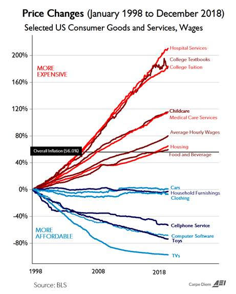
Overall, the result we see is astounding. In a word, the price increases shown for hospital services, college textbooks, and college tuition are startling. Meanwhile, the zero price increases and decreases reported for cars, household furnishings, and clothing offer some comfort.
Stay informed.Stay ahead.
Join Washington Examiner for unlimited access to the news, analysis, and commentary that matter most.
Already a member? Log in
