


The Department of Labor’s December Job Openings and Labor Turnover report brought some apparent good news regarding the job prospects for the working population. Once again, the number of jobs looking for people exceeds the number of people looking for jobs. Setting another new record, the JOLTS ratio for the number of open jobs per unemployed person rose to 1.17.
As we might expect given the dynamics of the economy, the location of job openings never seems to quite match the addresses of people looking for work. Some industries are expanding, others are declining, and regional specialization can lead to frustration for both job seekers and those looking to hire.
Recommended Stories


This Bureau of Labor Statistics map shows growth in employment for the 50 states for June 2017 through June 2018. The highest employment-growth states are colored darkest green. It tells us that if you are looking for work, it makes sense to go west — this is where job growth is highest.
By comparison, the states arrayed along and east of the Mississippi River, with the exception of South Carolina, tend to show weaker growth. Only Vermont in the eastern patch shows negative growth. Alaska is the other negative growth state.

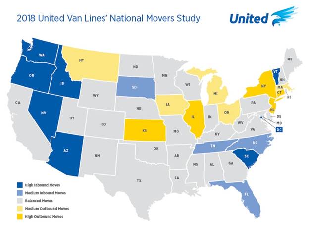
For a typical family, making a move from, say, Illinois to Oregon to take a better job is no simple matter. But there are data that suggest plenty of people are doing just that. The next 50-state map was developed by United Van Lines using 2018 data on household moves. In this map, states that are attracting more people than they are losing are colored darker blue. Those losing more households than they are gaining are colored yellow.
This one tells us that people are voting with their feet. Apparently, tighter labor markets can attract job seekers, but the trend is clearly against them. According to United Van Lines, the top destination states are led by negative-job-growth Vermont, followed sequentially by Oregon, Idaho, Nevada, Washington, Arizona, and South Carolina, which are each high-employment growth states.
There are other factors to be considered along with job opportunities that affect decisions to pull up stakes and move. Included, of course, are taxes, housing costs, the availability of healthcare, recreational opportunities, and low crime rates, just to mention a few.
Unfortunately, the two maps cannot explain why employment growth varies so widely across the states. But a quick glance at the first map tells us that manufacturing and grain-producing states like Ohio, Minnesota, and Wisconsin tend to be the weaker elements in the story.
It’s also likely that tariff wars are taking a toll on growth, but this tale reinforces how the U.S. economy’s ever-changing economic complexion draws people from those manufacturing and grain-producing areas toward knowledge-based and high-technology work.
There’s one final piece to the JOLTS story that deserves attention. Rising employment prospects are pulling more people into the labor force. The labor participation rate, which excludes unemployed people who are not seeking work, is rising. Improved labor productivity offers hope and the promise of rising prosperity for many, even those who not so long ago had neither.
Bruce Yandle is a contributor to the Washington Examiner‘s Beltway Confidential blog. He is a distinguished adjunct fellow with the Mercatus Center at George Mason University and dean emeritus of the Clemson University College of Business and Behavioral Science. He developed the “Bootleggers and Baptists” political model.
